Tuesday, December 13, 2016

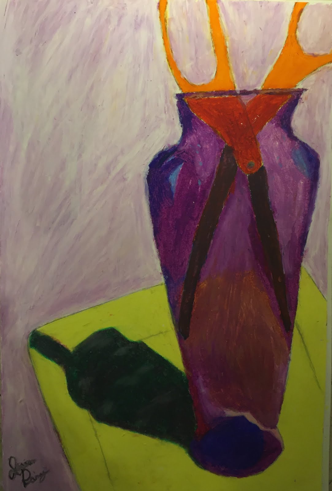
Oil Pastel Color Study


For this assignment we had to create an interesting colorful composition and draw it using oil pastels. My goals and intentions in this work were to create different colors, especially the ones in the purple vase. I wanted to use different textures and colors to make certain parts stand out. I accomplished this by using the other parts of the paper to mix colors, and taking several pictures of my composition to understand all the different parts. What surprised me most was how easy the pastels blend. My drawing is about an interesting composition, and different values of different colors. The most difficult challenge was definitely getting the right color for the shadow and the blade part of the scissors. I met that challenge by trying different shades and getting advice from Mr. G and my friends. I experienced artistic thinking when I began to mix shades that went together with the other colors in my drawing. My drawing really works in the vase and the background. Some things I learned were blending, shading, and using white to erase. Another artist in the class I learned from was Laura, her pastels blended really well and all her values and colors went together. If I had a do-over I might choose different colors, or try and make it more realistic. I feel the best thing about my work is the different colors and the texture.

Two-Page Artist Spread

This is my two page spread on the artist Van Gogh.


Sunday, November 27, 2016

jpg. #6 Leftovers

For this jpg. challenge, we had to post five or more pictures of our interpretation of "leftovers". For me, I took some things that I've started and haven't finished, or some things that I started and quit or "left behind".


I have many drawings that I've started but not finished, or decided that I don't like, so I consider them "leftovers".


I took ice skating lessons for several years, but then stopped, even though I still like to skate.


These are several books that I found stored away in my closet, that I have started reading but haven't yet finished.


I have many old notebooks that I began writing in, but haven't filled up, I don't usually write in them anymore and they can be considered leftover.


This is my piano. I took piano lessons most of elementary school and middle school, but I stopped and now take guitar, so it is kind of "leftover" since I don't practice as much.

Thursday, November 17, 2016

Into the Night- Charcoal Version


For this work I took a picture I had taken of my street late at night, and used charcoal to make it into a drawing. When I go for a walk at night, these shadows and lights are what I see. I tried to show contrast between light and dark, and I also tried to create different textures and values throughout my drawing.

Friday, November 4, 2016

Carry-Out Charcoal Drawing


For this studio assignment we had to draw a Carry-Out carton with chopsticks out of charcoal. My goals and intentions were to make certain values pop out and create a realistic drawing. I accomplished this by experimenting with different shades and different types of charcoal, and by outlining parts of the carton differently. My painting is about dramatic shadows, smoothness, and the contrast between lights and darks. The most difficult challenge I had to face was creating the correct proportions and drawing the chopsticks correctly; and I met that challenge by trying different ways to draw them, and by cropping my composition. My drawing really works on the inside of the carry-out carton. Some things I have learned that I can bring into my next drawing were using new types of charcoal and blending techniques, such as using my eraser. Another person I can name in the class would be Lauren because her drawing was really nice, she had a different composition and a lot of depth to her drawing and she helped me with the shadows. If I had a do over, I might create a new composition and try to draw the chopsticks again. I feel best about how much I improved from my pumpkin charcoal artwork to this artwork.

Sunday, October 23, 2016

jpg. #5 Into the Night

For this jpg assignment we had to take some pictures showing light, shadows, and things such as mystery/drama. Here is what I came up with:


Thursday, October 20, 2016

Charcoal Drawing


For our second project we had to "carve out the light" from a still life, using charcoal. I created a set up where a small pumpkin was in the shadows behind a larger pumpkin, and a bone was around the two. My goals and intentions in this artwork were to show how just one light can cast different shadows on an object. I accomplished them by using different types of charcoal, chalk, and erasers. What surprised me most was how easy it was to fix something if you messed up. My drawing is about how shadows and value can change how you view a composition. The most difficult challenge was getting the pumpkin to actually take the shape of a pumpkin, and getting the shadows dark enough. I met that challenge throughout the whole course of the drawing. I experienced artistic thinking when I thought about the composition as just lines and shadows- not actual objects. I feel my drawing really works in the middle of the bigger pumpkin, because of the light and outlines. Some things I've learned that I can use in the future are how to look at you're composition in a different way, and how to use different materials. In my class, Annie used really dark shadows in her drawing that caused a lot of shadows and added a lot of depth. If I had a do-over, I would draw a composition that was more close up with the light in a different place. I feel the best thing about my work is the middle of the picture, because it has the most detail and catches your eye.